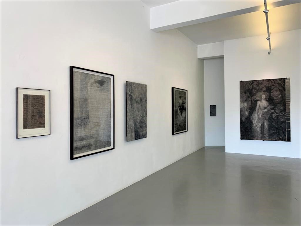
We were taken by the works on display at Colour in Black and White, which is on show at David Krut Projects in Parkwood until October 15. While art may be a way to escape the confines of architecture, the architect is in his artwork, visible in Cohen's meticulous attention to detail as he pieces together pixels of paint to make landscapes and figures swim in and out of focus. While black and white defines the work – Cohen manipulates light, scale and structure in such a way that he creates a sense of full colour.
We asked Peter Cohen some questions about his work as an artist and an architect.
Did you ever imagine that you would have a solo art exhibition?
I only started making work in November 2020 so an exhibition of any sort feels quite surreal and unexpected.
When you are Peter Cohen the architect what is your approach to drawing vs when you are Peter Cohen the artist?
The approach is completely different, as is the creative process. When designing buildings I am working with the interconnection of internal and external spaces to combine functional, spatial and sculptural forms. The freedom to create is within those confines. As an artist that freedom is constrained only by my choice of scale and medium.
At the exhibitiojn opening, you spoke of how the practice of painting was initially a way to escape the confines of the Covid-19 lockdown and architecture, and that at first the works were very abstract. How did your approach change once you consciously started to bring meaning into your work?
The freedom I mention above is what drew me to making art, but it was specifically the processes I was using that evolved over time. As the processes evolved so did the imagery within the work. There is still a great deal of abstraction that takes place, but the work became rooted in historical imagery, scale and proportion, rather than being purely abstract, so in a sense, while escaping the confines of my architectural training, I am also using those thought processes in my art making.
"A monochromatic palette is a tool for me that I feel enhances the process."
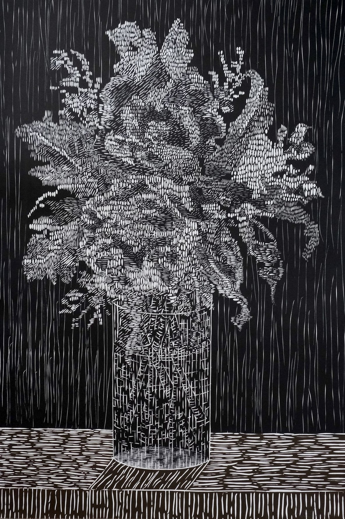
There is a fair degree of abstraction in your work with the figure, be it a person or landscape, often being somewhat obscured. As one looks at your works for longer these figures begin to emerge as if slowly woven into being. What is the process behind this abstraction?
This varies from work to work, but in essence, I am working with different processes of abstraction that purposefully set out to conceal and reveal images depending on how the work is viewed.
Even with the abstract nature of your work, there is still an underlying structure, particularly with your almost tapestry-like paintings. In planning these tapestry pieces do you rely on some of your more architectural instincts for construction?
I don’t know if it is specifically architectural, but the use of grid and line feels tapestry-like when constructed by hand and in layers that seem woven. For me, this comes more from looking at the construction of tapestries than from an architectural structure.
What scares you about colour?
I wouldn’t say I have a fear of colour. A monochromatic palette is a tool for me that I feel enhances the process.
In terms of colour, your work is — as the title of the exhibition suggests — largely in black and white with you using varied tones of greys and some browns. In the past two years has the art you’ve been making all largely been devoid of colour?
Initially, I used blue in some of the purely abstract work, but as the work evolved, it became more about construction, scale, proportion and technique, so the limited palette allows me to focus on that, rather than becoming caught up in mixing colours.
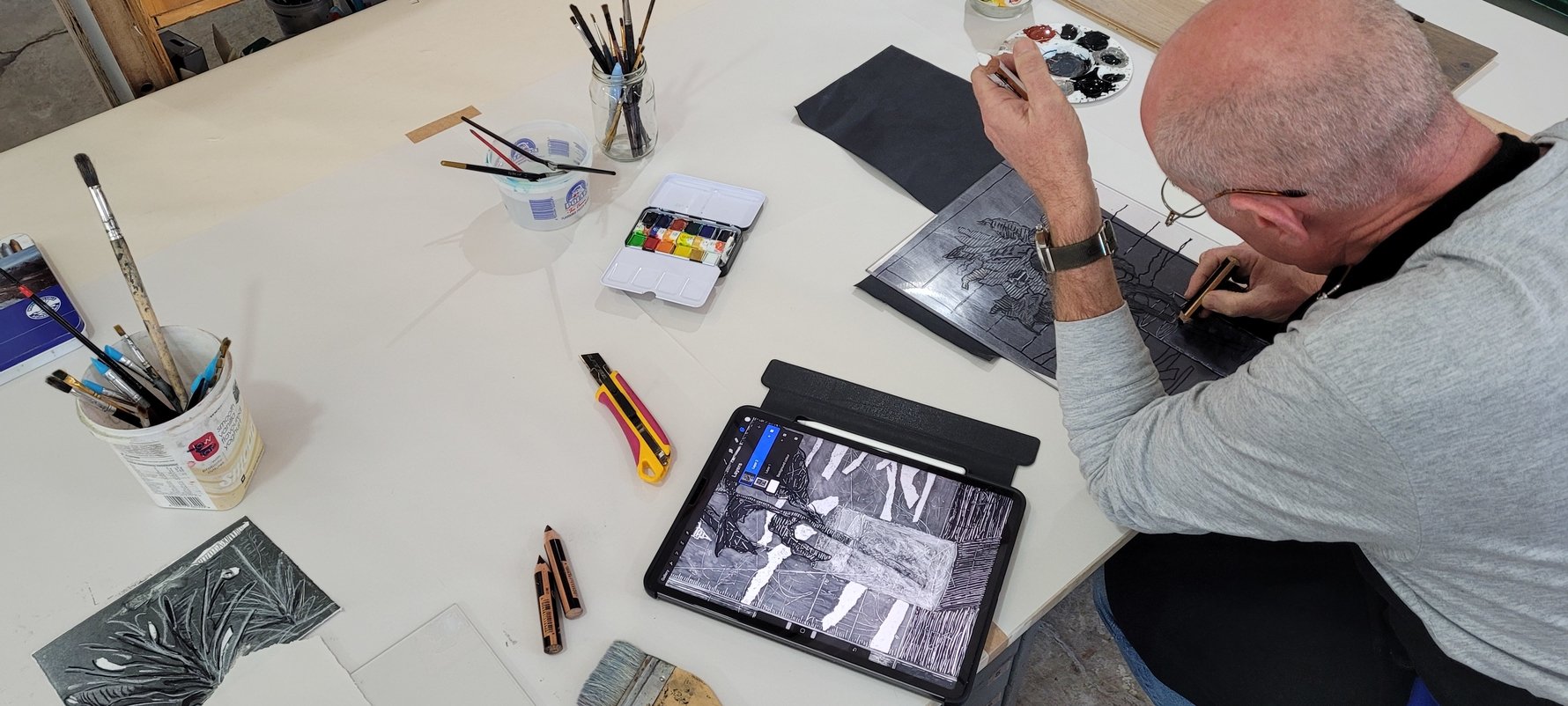
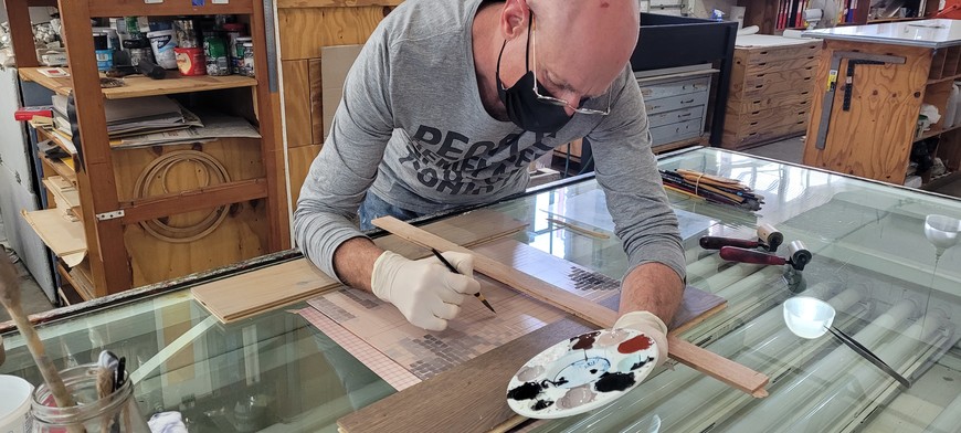
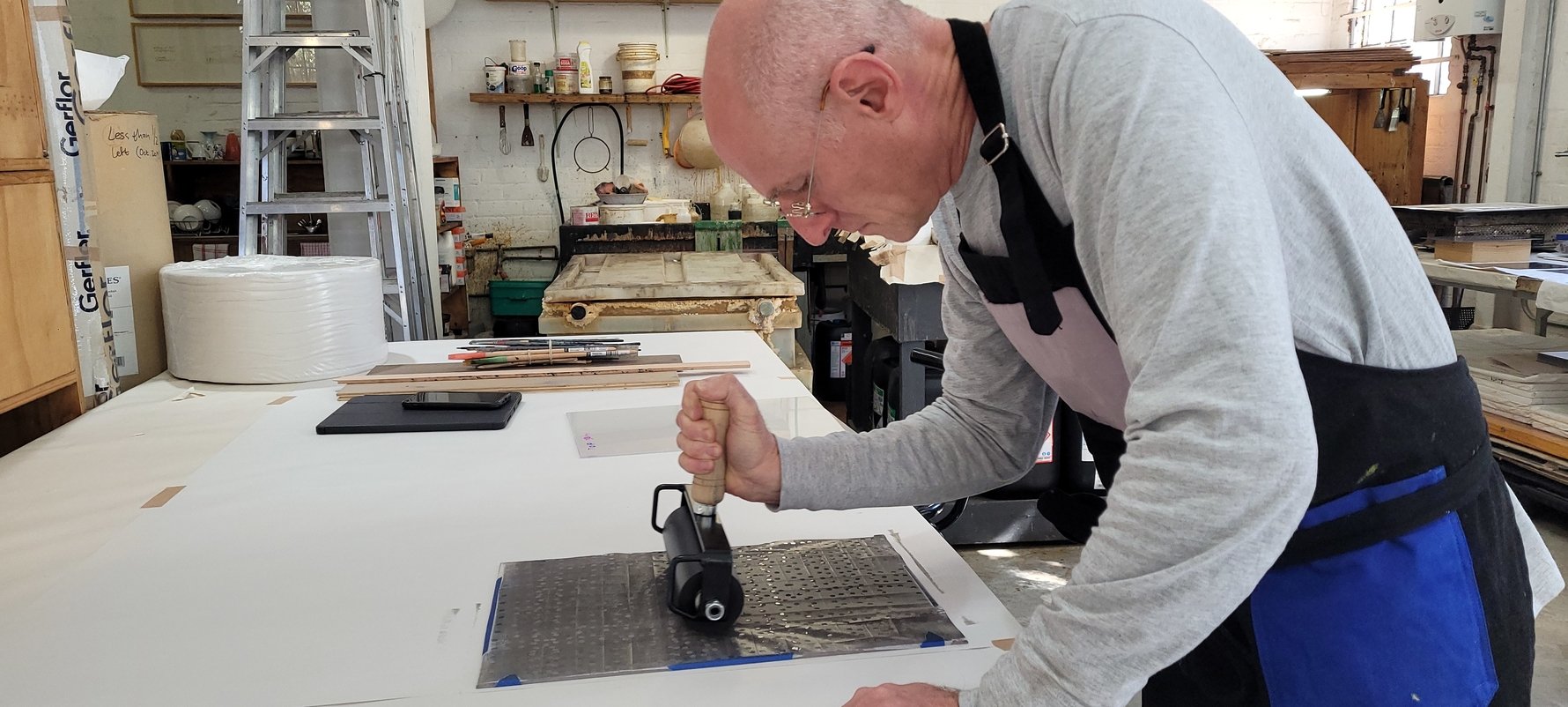
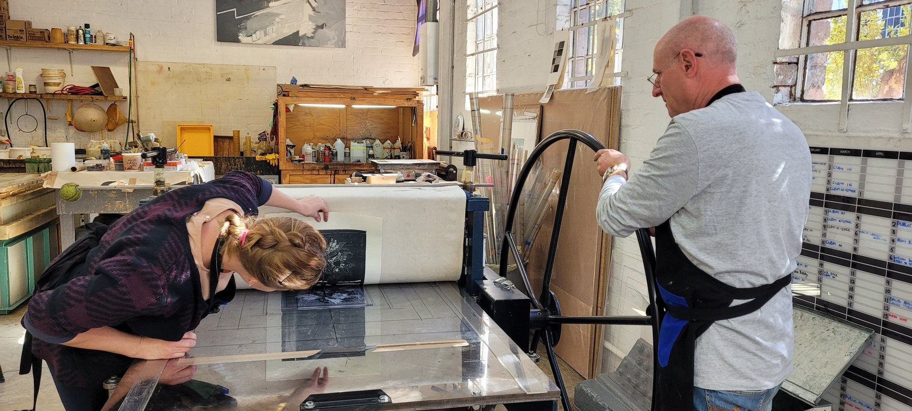
Was your work at David Krut Projects your first exposure to printmaking?
Yes. I think there is a misconception that making a print means that what you have created is somewhat ‘less’ than a unique piece would be, whereas the complexities involved in printmaking actually mean that one is doing the same unique art-making but in a different way.
What differences did you notice in how you approached making art when having to do a print versus painting?
I think the best thing I have experienced in printmaking is the collaborative effort that is involved and while I love the solitary time spent painting, being in the print studio provides a different viewpoint and has had an influence on my painting.
As an architect, you deal with a fair amount of collaboration, be it with clients, builders or other architects. How did the collaborative process at David Krut differ from the collaboration you do as an architect?
I don’t think it’s that different. As both an artist and an architect one is in control of the final product. There is always conceptual work in both cases that must be solitary and that forms the essence of the work, but when working with others it is one’s approach to that process that makes a work a success. While as an artist/architect you are in control, I think one must be mindful that it is the collaboration of minds that is additive to the process.
What draws you to paint a certain person or landscape in your work?
In architecture, we were always taught to learn the rules before breaking them or even sometimes discarding them completely. Looking at classical work (scale, proportion etc) has therefore always been important to me, even if there is no obvious direct reference to that in the final product. So I look at art in the same way and try to learn from that. I think that sense of history comes through in the work.
You point to classical landscapes and tapestry as references underpinning your work. What other places, people or experiences do you draw on for inspiration?
When I started painting it was at a time during Covid when people were quite isolated and so many of the museums and galleries opened online portals where one could view the works on exhibit, and that enabled me to ‘travel’ in a sense that allowed me to see a vast array of work. I am always drawn to periods in history that have no real context for me so there is a kind of mystique attached to them. While they will in most cases be real historical figures, or in the case of landscapes a real locality, for me they will have their own story that is removed from their actual history and I can therefore concentrate on the construction of the work and what the work feels like for me.
"My introduction to the art world has been sudden and exciting and I look forward to greater interaction with the people and processes."
Why is tapestry an inspiration?
It’s about texture and mood and feeling. And it allows for a structural abstraction. It’s also about how we have learnt to see. Pixelation and its structure feel to me almost tapestry-like when combined with different types of line constructions.
Before going to David Krut you had been largely self-taught as an artist. Do you think you will return to working in a more isolated manner now or are you hoping to do more collaborative work?
Because my art making is largely a nocturnal activity, it will always be mostly solitary. That being said, art classes offer a space for discussion that will often provide a shift in one’s mindset that is essential for growth and will always be necessary for my solitary work. The collaborative work, however, is fascinating and provides a different dimension and there is a lot to learn so I look forward to much more of that in the future.
What’s next for Peter Cohen the artist?
Hopefully more of the same. The compulsion to produce means that I am always working. My introduction to the art world has been sudden and exciting and I look forward to greater interaction with the people and processes.
Another exhibition currently showing at David Krut is Stephen Hobbs’ A short Life with Bungalow Bliss. While he never trained as an architect a lot of the pieces in this project deal with space and the ways it can confine us. Did you manage to interact with him much while working at David Krut? There seems to be an increasing intersection between art and architecture, what is your take on this?
Stephen was present on a number of occasions at the print studio. Interestingly, some of his work has an almost plan-like structure and so yes, in his work there does seem to be a definite architectural connection. With my work, however, if there is an intersection it is not purposeful. While there may be evidence of grid and structure, I am using that to simultaneously support and conceal the images I am creating, and this is done in a way that is not architectural in nature.
What were the highlights of your time spent at David Krut?
I think it really was about collaboration and how the creative process is bigger than just one person.
What are some spaces in Johannesburg that inspire you?
The view from the M1 South overlooking Newtown and the city beyond, the spaces that are created by the avenues of trees in the older suburbs and the elevated views over those trees from places like Westcliff.
Three words to describe Johannesburg.
Trees, thundershowers, home.


Comments